
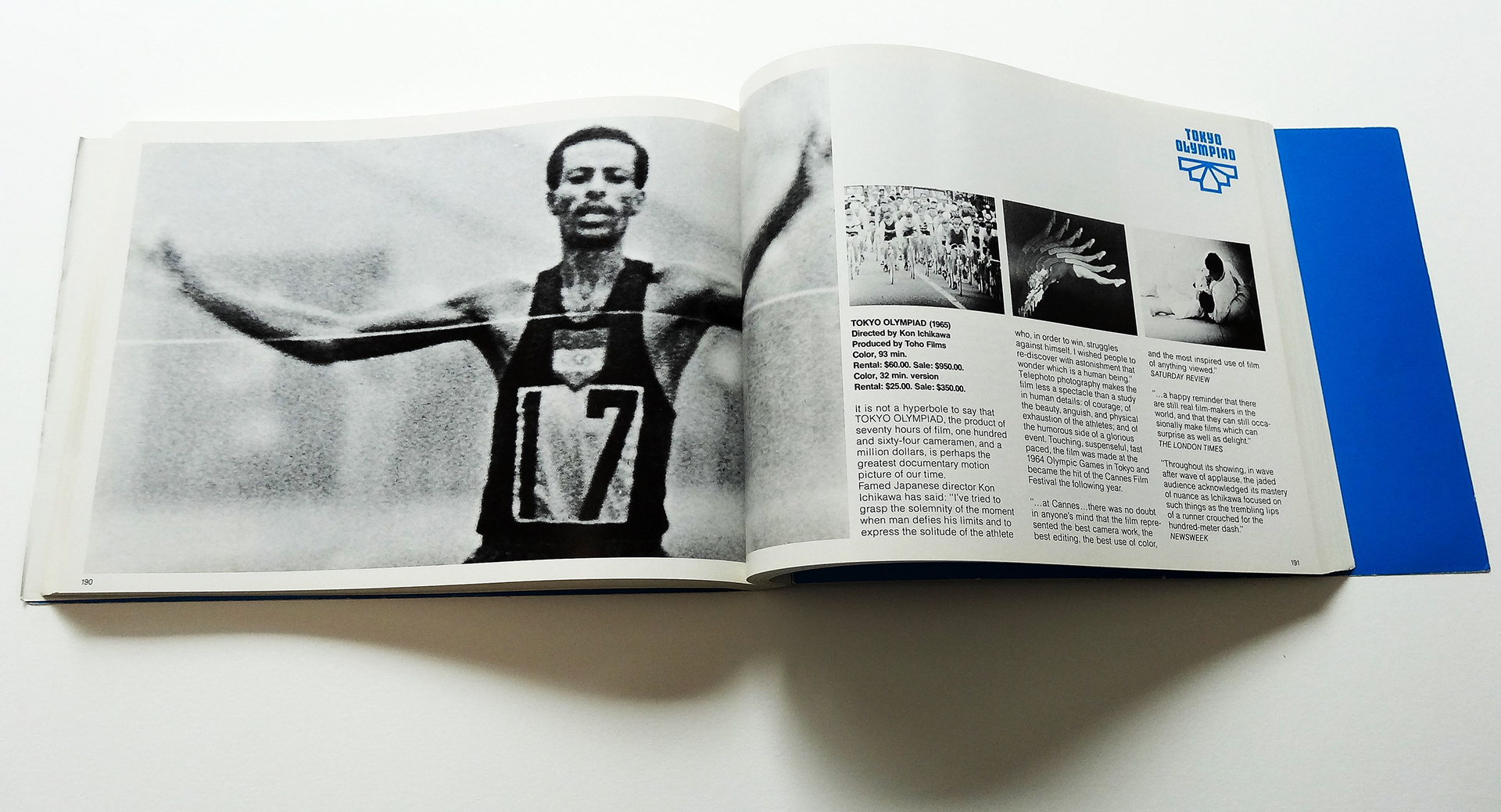
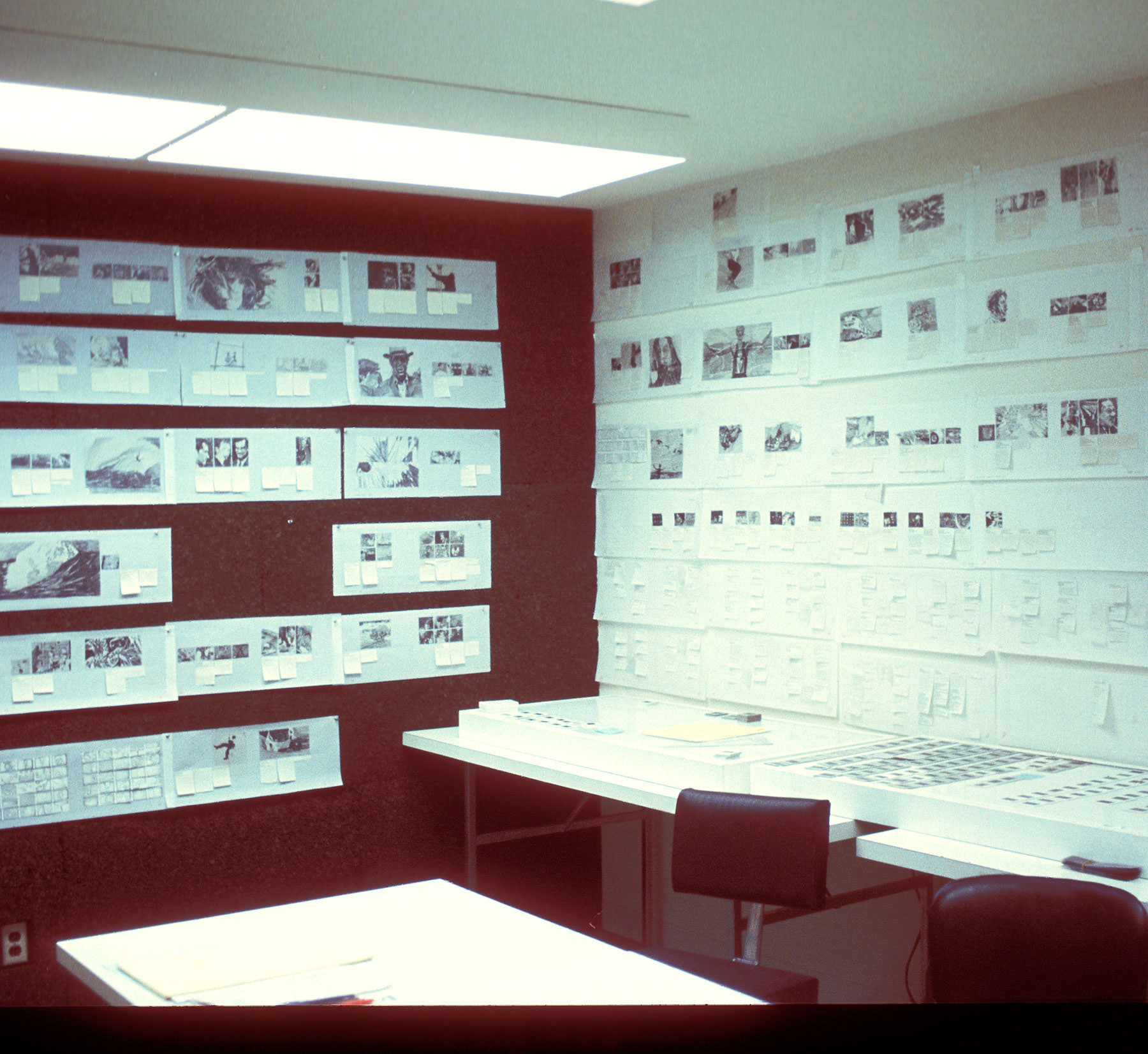
In 1971 at Saul Bass & Associates in Los Angeles I designed layouts for the AT&T Yellow Pages for its first application of computer typesetting; this was a huge challenge that I surprisingly enjoyed. AT&T was a big client of SB. I also designed the first film catalog for Pyramid Films—another great project—every one of the 300 pages was filled with images from their films. I sketched full-size layouts for all the double spreads to be able to visualize and balance the flow of large and small images, eventually taking over a whole room.


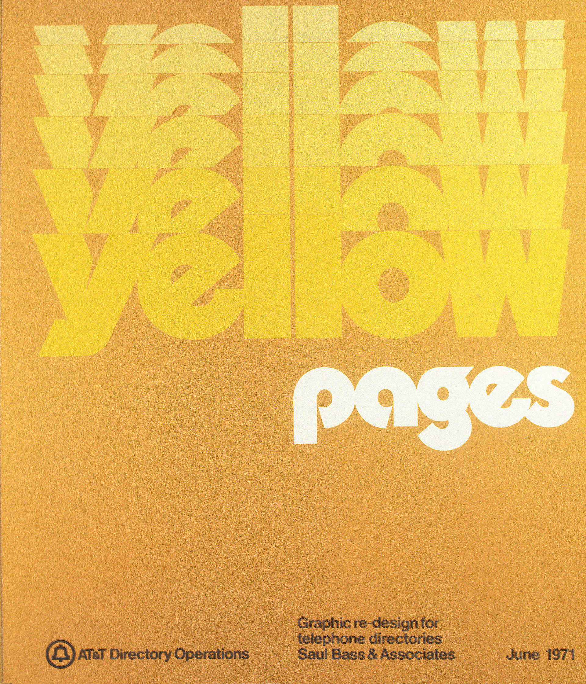
Redesigning the Yellow Pages was an enormous undertaking. The first task was to adapt a version of the typeface Helvetica—then apply the typeface to every aspect of the Yellow Pages: index, information pages, double-page spreads, small one column ads, special locality list headings, etc.
The position of large ads on the pages was very important to AT&T—all advertisers wanted their ads to appear on the upper right of the double spread and paid more for this.
The position of large ads on the pages was very important to AT&T—all advertisers wanted their ads to appear on the upper right of the double spread and paid more for this.
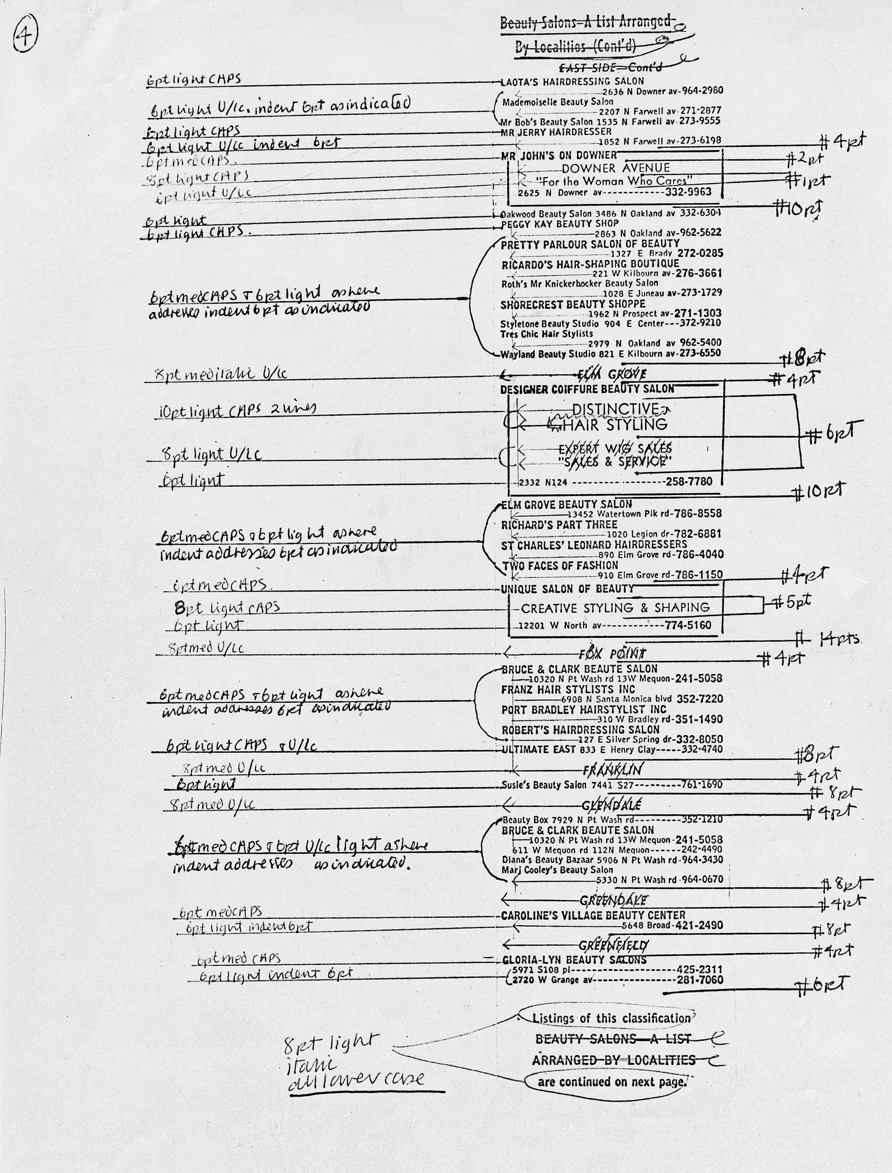
Above is a hand-drawn type mark-up.
When I was testing and designing a wide variety of yellow page layouts to demonstrate the proposed new designs, each new yellow page required a type mark-up as shown here. This was the first use of computer typesetting for AT&T and at that time all typesetting was sent out to a "type house"—long before desk-top publishing, when anyone could become a typographer.
When I was testing and designing a wide variety of yellow page layouts to demonstrate the proposed new designs, each new yellow page required a type mark-up as shown here. This was the first use of computer typesetting for AT&T and at that time all typesetting was sent out to a "type house"—long before desk-top publishing, when anyone could become a typographer.
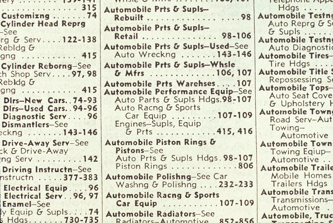
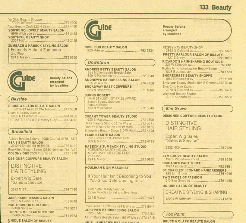
On the left is the old Yellow Page Index type; on the right is the new design for the Index type.

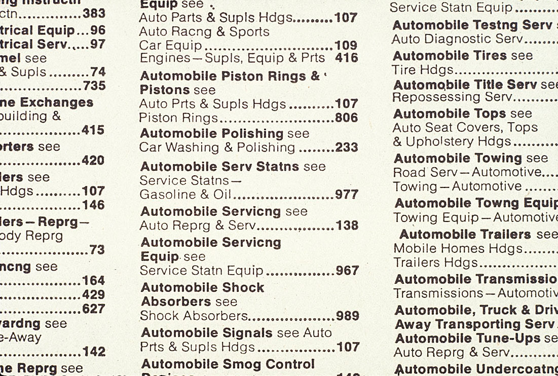
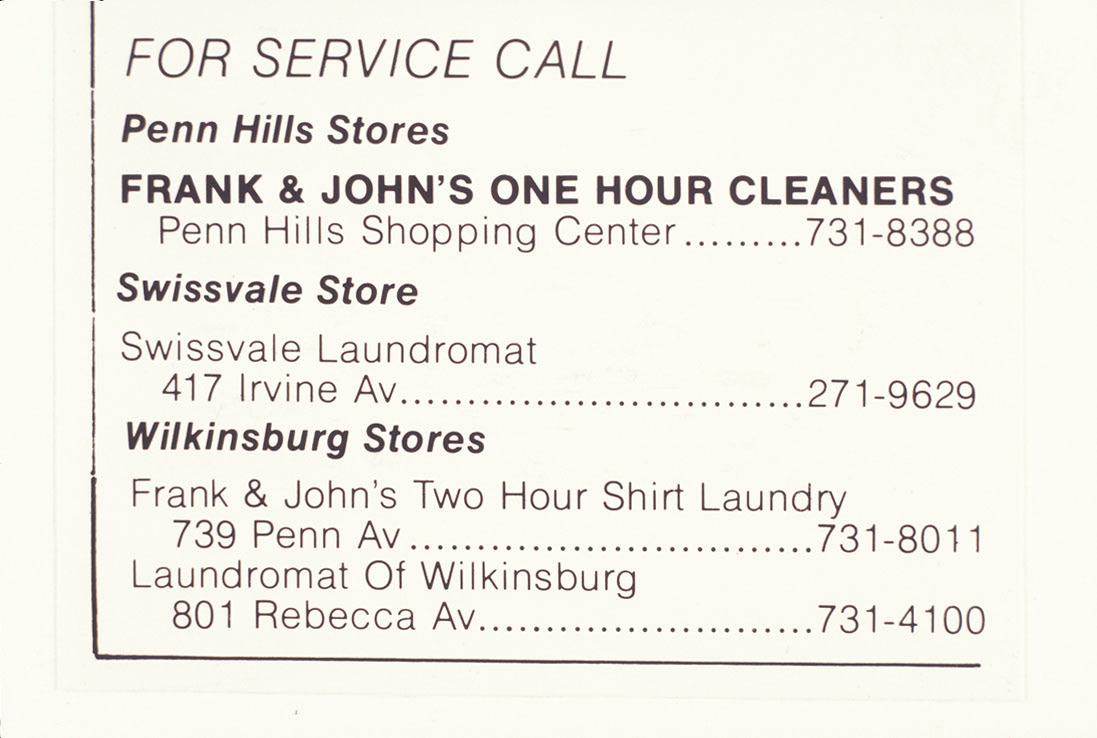
An old small one-column ad is on the left; on the right the new small one column ad.
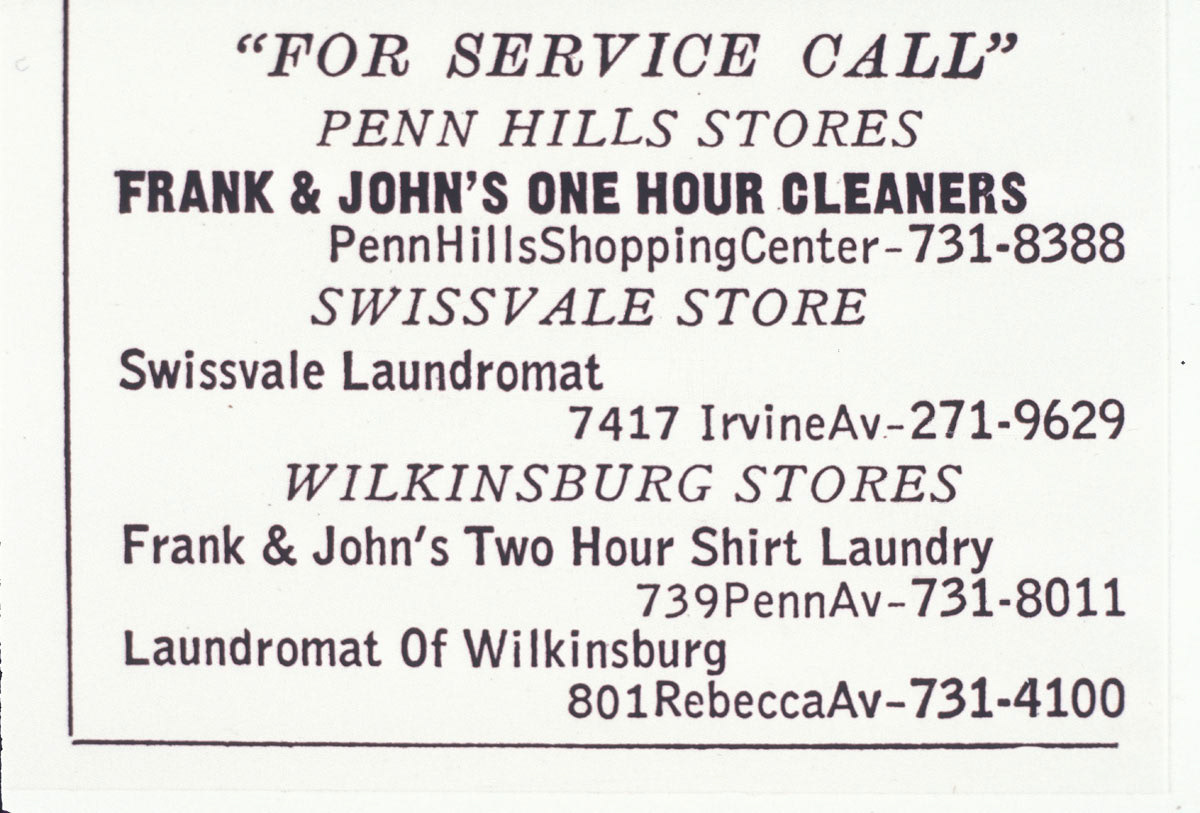
Another example of the old one-column ad on the left and the new one-column ad on the right.
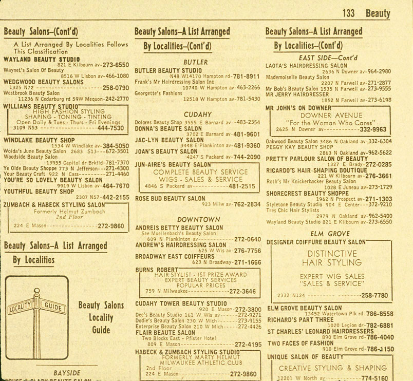
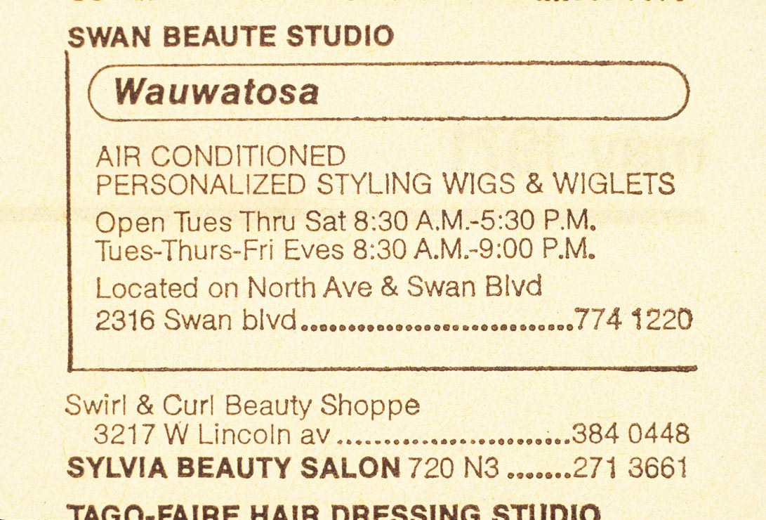
A comparison of ad treatments for: single column ads and area listings by localities; the old version is on the left and the new on the right.